Free Download:
XLSForm with "Population Pyramid in Excel"
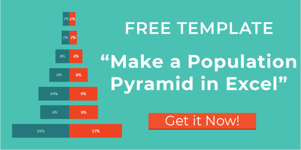
This is the template that I shared with you in the blog post here.
Creating a population pyramid chart in Excel can help a lot in your report. It's especially useful when you're looking at survey results about how many men and women there are in different age groups in households. This XLSForm will help you how ages and genders are spread out in a population, which helps you understand things better.
Feel free to download, modify, and use it as needed for your humanitarian or development programme!
If you'd like to email me and let me know how you're using it, I'd love to hear the story about your programme!
Have a blessed day,
Janna